Author Topic: Hideous Box Art  (Read 8236 times)

Re: Hideous Box Art
« Reply #15 on: March 10, 2015, 07:05:30 pm »

Generally Master System covers are pretty bad but this one is just hilarious.


Someone took some OKAY concept art, slapped it into Photoshop and played around with glow and bevel effects on the text. I never played it but apparently it's considered a hidden gem by most accounts.


Nightmare fuel.


Thankfully North America never bore this monstrosity.
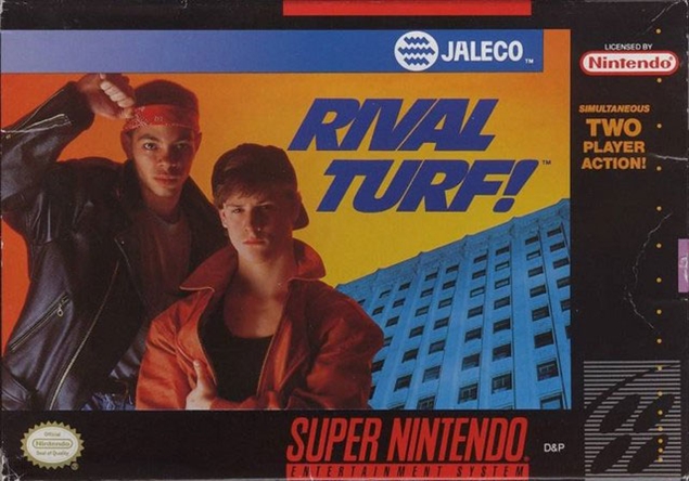

This just screams early 90's.
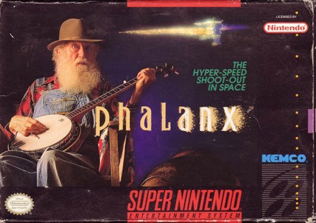

Pretty sure most people have seen this one by now. -Decent game by the way.
« Last Edit: March 10, 2015, 07:13:28 pm by badATchaos »

burningdoom

PRO Supporter

Re: Hideous Box Art
« Reply #16 on: March 10, 2015, 07:25:02 pm »

This just screams early 90's.

If it was 1991, that would be awesome.

Re: Hideous Box Art
« Reply #17 on: March 10, 2015, 07:41:04 pm »
Having labels that say greatest hits and are ugly are one thing!  Having an entire case that is another color is worse imo.  The bright red PS3 greatest hits cases make me want to stain everything around me with my own matching blood (of course I'm kidding).  Seriously though, what goes through their head that says, "Hey, this is a great idea!  This will really make fans happy".  It's almost like they are trolling us.  I can handle game cartridges, like DOOM on SNES being a different color, but if I'm paying for a case, it better GD match my others ones lol.  This might be a topic for another thread, but I even get bothered that some of my PS2 cases are slightly blue and others are black.

Still a little bothered PS3 couldn't just pick a logo for the system and stick with it. They started out red, then they had to look like PSP games, now they need to look like PS4.

I'm not a fan of the Sega Master System boxes either. They all start to blend together.

indenton

Re: Hideous Box Art
« Reply #18 on: March 10, 2015, 08:24:27 pm »
I'd say it was pretty bad.  Looks like incredibly half-assed photoshop art.  No sense that anyone making it had any idea what they were doing lol

I don't know why I second guessed myself their, I though maybe I would be exaggerating

that character model... EURGHH!!

retroone

Re: Hideous Box Art
« Reply #19 on: March 10, 2015, 08:48:36 pm »
It starts.....


How has this one not been mentioned I mean Mega Man with a gun?


The 90's were a radical time....


When I first saw this I thought it was a game about Customer Service. Lol.

Re: Hideous Box Art
« Reply #20 on: March 10, 2015, 09:25:12 pm »
The only good thing I can say about this box art is that it accurately represents the game:


...what? :o


If you hold this box art up to a mirror, the world will end:


Haha, the first thing I did was search to see if anyone has "Irritating Stick"  on VGCollect

Re: Hideous Box Art
« Reply #21 on: March 11, 2015, 01:17:19 am »
Honestly I think all "GH/Best" variants of box art is horrible. There is a reason everyone goes for the originals. haha. Only good one is PSP Favorites.

^^^^^^

Someone else also mentioned 'favorite' or 'unique' box art in another thread... we should do this for a podcast sometime! C:

But yeah, greatest hits and stuff is just so annoying. >.<

I'll just say sports games in general, because they're not very creative, usually. xD

gf78

Re: Hideous Box Art
« Reply #22 on: March 11, 2015, 10:21:29 am »

Generally Master System covers are pretty bad but this one is just hilarious.


Someone took some OKAY concept art, slapped it into Photoshop and played around with glow and bevel effects on the text. I never played it but apparently it's considered a hidden gem by most accounts.


Nightmare fuel.


Thankfully North America never bore this monstrosity.


This just screams early 90's.


Pretty sure most people have seen this one by now. -Decent game by the way.

I almost spit my drink out when I saw the Black Belt cover!  My kids could doodle-up a better drawing than that in about two minutes!
Currently playing:  Last of Us Part II Remastered, Cyberpunk 2077 Ultimate Edition
Currently listening to:  Iron Maiden & Ghost
Currently Watching:  Cyberpunk Edgerunners & Last of Us

gf78

Re: Hideous Box Art
« Reply #23 on: March 11, 2015, 10:22:22 am »
It starts.....


How has this one not been mentioned I mean Mega Man with a gun?


The 90's were a radical time....


When I first saw this I thought it was a game about Customer Service. Lol.


LOL...I figured I would leave that one for someone else.  Mega Man 2 wasn't much better either.  Instead of a geezer with a gun, it's a fat guy with a gun.  Big improvement.   ::)
Currently playing:  Last of Us Part II Remastered, Cyberpunk 2077 Ultimate Edition
Currently listening to:  Iron Maiden & Ghost
Currently Watching:  Cyberpunk Edgerunners & Last of Us

gf78

Re: Hideous Box Art
« Reply #24 on: March 11, 2015, 10:52:38 am »
Anticipation for the NES.  Nothing like bad 80's clothes & hairdo's for the cover of your game!
Currently playing:  Last of Us Part II Remastered, Cyberpunk 2077 Ultimate Edition
Currently listening to:  Iron Maiden & Ghost
Currently Watching:  Cyberpunk Edgerunners & Last of Us

burningdoom

PRO Supporter

Re: Hideous Box Art
« Reply #25 on: March 11, 2015, 12:59:04 pm »
Most Sega Master System cases are pretty damn bland looking.

gf78

Re: Hideous Box Art
« Reply #26 on: March 11, 2015, 01:47:05 pm »
The only good thing I can say about this box art is that it accurately represents the game:


...what? :o


If you hold this box art up to a mirror, the world will end:


And Acclaim wondered why they went out of business????
Currently playing:  Last of Us Part II Remastered, Cyberpunk 2077 Ultimate Edition
Currently listening to:  Iron Maiden & Ghost
Currently Watching:  Cyberpunk Edgerunners & Last of Us

gf78

Re: Hideous Box Art
« Reply #27 on: March 11, 2015, 01:57:06 pm »
Having labels that say greatest hits and are ugly are one thing!  Having an entire case that is another color is worse imo.  The bright red PS3 greatest hits cases make me want to stain everything around me with my own matching blood (of course I'm kidding).  Seriously though, what goes through their head that says, "Hey, this is a great idea!  This will really make fans happy".  It's almost like they are trolling us.  I can handle game cartridges, like DOOM on SNES being a different color, but if I'm paying for a case, it better GD match my others ones lol.  This might be a topic for another thread, but I even get bothered that some of my PS2 cases are slightly blue and others are black.

Still a little bothered PS3 couldn't just pick a logo for the system and stick with it. They started out red, then they had to look like PSP games, now they need to look like PS4.

I'm not a fan of the Sega Master System boxes either. They all start to blend together.

I can tell from your posts that changes like these and/or having a non-NTSC version of a game really bothers you.  I get it, I'm pretty anal retentive and obsessive compulsive myself. 

Sony had a bit of an identity crisis with the PS3.  I thought it was stupid they abandoned the "PlayStation font" for the PS3 and went with the Spider-Man movie one, but I dealt with it.  Then they changed it up and I was fine with the "PS3" logo and look.  And now I see what you are talking about with new PS3 releases sporadically having a blue banner and looking like a PS3 title at the top...and some don't.  I'm glad they did the box art and fonts for PS4 games as they did.  It should remain consistent throughout the system's lifespan and they also coordinated it with the PSVita cases. 
Currently playing:  Last of Us Part II Remastered, Cyberpunk 2077 Ultimate Edition
Currently listening to:  Iron Maiden & Ghost
Currently Watching:  Cyberpunk Edgerunners & Last of Us

gf78

Re: Hideous Box Art
« Reply #28 on: March 11, 2015, 01:59:38 pm »
The front cover for Suikoden immediately comes to mind. Just...I can't. Awful faces, awful hair and awful outfits. The design looks like it came from a bad, American comic series. None of the characters look like their anime counter parts.

Thank the GODS they stopped that tradition with Suikoden II and onward.

Yeah...that art is horrible.  It goes back to what I was saying about Japanese games getting a "makeover" with their artwork when they made their way out of Japan.  Suikoden like Final Fantasy and Dragon Quest had it's beautiful artwork removed for crap.
Currently playing:  Last of Us Part II Remastered, Cyberpunk 2077 Ultimate Edition
Currently listening to:  Iron Maiden & Ghost
Currently Watching:  Cyberpunk Edgerunners & Last of Us

Re: Hideous Box Art
« Reply #29 on: March 11, 2015, 04:09:04 pm »
I always thought the box art for R-Type on the TG-16 was pretty uninspired to say the least.  http://www.mobygames.com/game/turbo-grafx/r-type/cover-art/gameCoverId,71238/