Author Topic: Super Famicom vs Super Nintendo. Which is better visually speaking?  (Read 21665 times)

Hello Everyone :D.  I noticed with the super famicom button lay out Nintendo has been doing on even American releases like some of the new 3DS variants that the green, blue, red yellow layout of the buttons is not only awesome looking imo but also pretty culturally popular with a lot of people loving it for it's nostalgia and japanese exclusivity. 

With that said who do you think got a better looking piece of hardware, Japan or the UK/US regions?  :D.  I'll break it down into 4 categories.  The box.  The console.  The controller.  The cartridge.  And we all can decide which one we like more for each :)


Console


(The Super Nintendo is a design we all know and love and that we grew up with.  With it's purple manual switches for both power and reset along with a giant grey release lever.  When not yellowed it's really an amazing looking console :)

The Japanese version features a lot of differences. With it's two tone grey color scheme with the more vibrant colors on the logo in the tradition red, green, blue, yellow.  Definitely a neat look :)


Controller


Here we have both of the controllers in their natural habitat. Grazing.  Waiting to be held.   One visually continuing with the R,G,B,Y scheme and keeping all of it's 4 buttons rounded while the SNES goes with it's unique and iconic light purple, dark purple scheme with 2 of the buttons being concave.

SNES also has a much longer wire to be considered.   Which controller do you prefer?  :D


Console Box


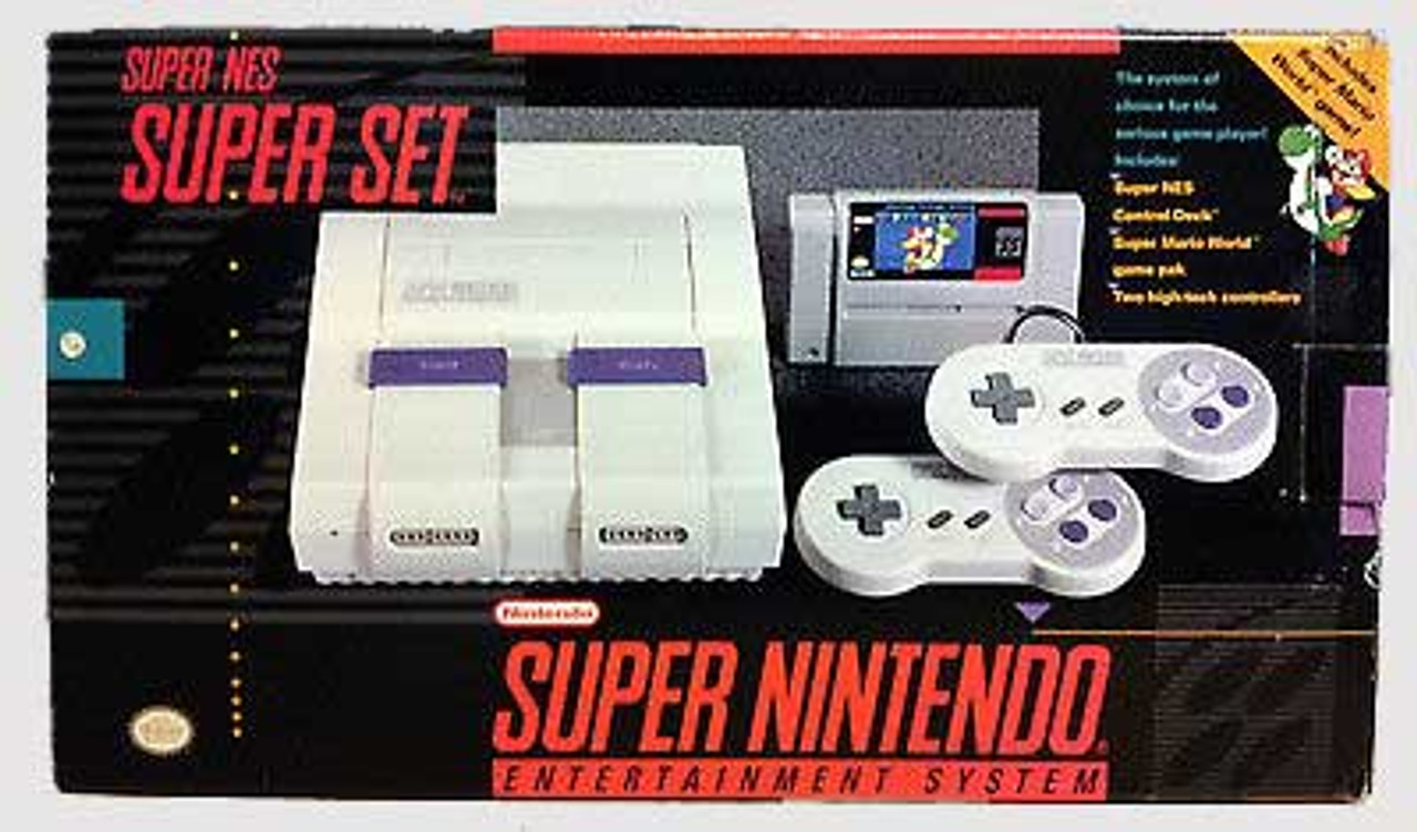
There is a lot of box variants for both systems but these are probably the two most popular and also two of the more standard boxes.  :).   For super Nintendo we have a visual representation of the console with some nice red lettering in bold large print.     For the Super Famicom we have a very artsy and vibrant multi colored visual of a super famicom with some neat abstract flare.   

Cartridges


For the final category we have cartridges.  Super Famicom featuring a more rounded look with a front label while SNES has a more boxed rectangular look with the label going up over the top of the cartridge doubling as a top label as well.   Both with varying cover arts as well based on region :).


My ratings and choices would be

Console- Super Famicom  (I love the two tone grey color but it could be because I like the uniqueness of it because I didn't grow up with it)

Controller-   Super Famicom  (This is the biggest win for SF in my opinion.  I love those non concaved buttons and the color scheme. :)

Box-  Super Famicom   (Really cool looking box although I prefer the box for SNES with donkey kong on it.

Cartirdge-  SNES   (The SF carts look a little plain to me and I love the grooves and the labels on NA SNES carts :D )


Which console do you like better visually and even just from playability?  Both are amazing and very different in their own ways.   ;D


Re: Super Famicom vs Super Nintendo. Which is better visually speaking?
« Reply #1 on: December 07, 2017, 10:39:11 pm »
It's a mixture for me. I like the SNES colors, but the Famicom console.  I like the colors, so I like the SNES controller more.  Famicom has the better box art, but I like the SNES carts more. 

Re: Super Famicom vs Super Nintendo. Which is better visually speaking?
« Reply #2 on: December 07, 2017, 11:16:41 pm »
Console=Snes by far
Controller=Super Famicom
Box=Snes
Cartridges=Snes by far

Re: Super Famicom vs Super Nintendo. Which is better visually speaking?
« Reply #3 on: December 08, 2017, 02:38:40 am »
To me Super Famicom is better in almost every capacity. Console styling, packaging, game box art in general. It uses the same power supply brick the original Famicom used, so that's kind of useful. They actually made use of the bottom expansion slot.  There was special kiosks where customers could download games onto a cartridge. The game library is also just... bigger. Support for SFC ran all the way to 2003 in Japan.

The only obvious bad thing about it was their controller cables were really short.

stealthrush

Re: Super Famicom vs Super Nintendo. Which is better visually speaking?
« Reply #4 on: December 08, 2017, 04:01:56 am »
Console = SFC
Controller = SNES
Box = SFC
Cartridges = SNES

burningdoom

PRO Supporter

Re: Super Famicom vs Super Nintendo. Which is better visually speaking?
« Reply #5 on: December 08, 2017, 10:17:27 am »
I don't like the brightly colored buttons on the Super Famicom controller, reminds me of a Fisher-Price toy or something.

ferraroso

Re: Super Famicom vs Super Nintendo. Which is better visually speaking?
« Reply #6 on: December 08, 2017, 10:27:42 am »
For me, the Super Famicom and the European SNES win by far in every category.

telly

Re: Super Famicom vs Super Nintendo. Which is better visually speaking?
« Reply #7 on: December 08, 2017, 10:30:44 am »
I like the console and controller design of the Super Famicom, but the box and cartridge of the SNES.
Currently Playing:
Eiyuden Chronicle: Hundred Heroes (PS4), Resident Evil 5 (PS4)

My music collection | My Backloggery

dreama1

Re: Super Famicom vs Super Nintendo. Which is better visually speaking?
« Reply #8 on: December 08, 2017, 11:22:30 am »
Hello Everyone :D.  I noticed with the super famicom button lay out Nintendo has been doing on even American releases like some of the new 3DS variants that the green, blue, red yellow layout of the buttons is not only awesome looking imo but also pretty culturally popular with a lot of people loving it for it's nostalgia and japanese exclusivity. 

With that said who do you think got a better looking piece of hardware, Japan or the UK/US regions?  :D.  I'll break it down into 4 categories.  The box.  The console.  The controller.  The cartridge.  And we all can decide which one we like more for each :)


Console


(The Super Nintendo is a design we all know and love and that we grew up with.  With it's purple manual switches for both power and reset along with a giant grey release lever.  When not yellowed it's really an amazing looking console :)

The Japanese version features a lot of differences. With it's two tone grey color scheme with the more vibrant colors on the logo in the tradition red, green, blue, yellow.  Definitely a neat look :)


Controller


Here we have both of the controllers in their natural habitat. Grazing.  Waiting to be held.   One visually continuing with the R,G,B,Y scheme and keeping all of it's 4 buttons rounded while the SNES goes with it's unique and iconic light purple, dark purple scheme with 2 of the buttons being concave.

SNES also has a much longer wire to be considered.   Which controller do you prefer?  :D


Console Box


There is a lot of box variants for both systems but these are probably the two most popular and also two of the more standard boxes.  :).   For super Nintendo we have a visual representation of the console with some nice red lettering in bold large print.     For the Super Famicom we have a very artsy and vibrant multi colored visual of a super famicom with some neat abstract flare.   

Cartridges


For the final category we have cartridges.  Super Famicom featuring a more rounded look with a front label while SNES has a more boxed rectangular look with the label going up over the top of the cartridge doubling as a top label as well.   Both with varying cover arts as well based on region :).


My ratings and choices would be

Console- Super Famicom  (I love the two tone grey color but it could be because I like the uniqueness of it because I didn't grow up with it)

Controller-   Super Famicom  (This is the biggest win for SF in my opinion.  I love those non concaved buttons and the color scheme. :)

Box-  Super Famicom   (Really cool looking box although I prefer the box for SNES with donkey kong on it.

Cartirdge-  SNES   (The SF carts look a little plain to me and I love the grooves and the labels on NA SNES carts :D )


Which console do you like better visually and even just from playability?  Both are amazing and very different in their own ways.   ;D
You're talking about that purple turd?


Re: Super Famicom vs Super Nintendo. Which is better visually speaking?
« Reply #9 on: December 08, 2017, 06:56:15 pm »
.
« Last Edit: January 10, 2018, 03:04:07 pm by jce3000gt »


Re: Super Famicom vs Super Nintendo. Which is better visually speaking?
« Reply #10 on: December 08, 2017, 07:34:34 pm »
I never actually saw a super famicom in real life or even played on one. But to me the super Famicom console looks like it's made more cheaply then the Super Nintendo. As for the controller on the Super Famicom I enjoy the sight of the multi colored buttons,

but the super nintendo in america looks more for adults then the super famicom,. I enjoy the also the looks and size of the super nintendo in america's cartridges and the console as well. I used to own a Super Nintendo and the console switches were always easy to use on or off or even reset. and I also liked it's large eject button

to me the super famicom looks like the console switches would stick after excessive use. while the super Nintendo in america the console switches  feel like they could take more abuse the the super famicom switches in Japan and  Europe.
updated on 5-14-2024 5:30AM (EST)
MY RADIO STAION (Licensed but not a business)
(JUST INTERNET CONNECTION REQUIRED)
NO APPS NEEDED
64k stream ACC format sound meaning

Clearer Sound Quality for Half the internet data Usage
over 28,000 song playlist and 100 automated DJ talk and history lesions "commercial free" "No subscription needed"

https://nap.casthost.net:2199/start/Justinangelradio/

(requires Google Chrome or Firefox Edge does not work with this link but other links exist)

Re: Super Famicom vs Super Nintendo. Which is better visually speaking?
« Reply #11 on: December 08, 2017, 07:39:12 pm »
I'm from France so I grew up with the european SNES which looks almost the same as the super famicom so imma go with this one ^^

aliensstudios

Re: Super Famicom vs Super Nintendo. Which is better visually speaking?
« Reply #12 on: December 08, 2017, 11:34:28 pm »
I always liked the North American version best. The multicolored buttons and smooth rounded design always just looked a bit to goofy to me, sort of like the N64. I like the square carts with the end labels best as well. Also, I have the Donkey Kong Super Set. Frigging love the box art on that system, one of my best finds ever, so yeah, I like the North American console box better too. I guess it's because I'm so familiar and nostalgic for the North American version.
« Last Edit: December 08, 2017, 11:43:57 pm by aliensstudios »
"I collect vidya games and vidya game accessories, I tell you what."

Re: Super Famicom vs Super Nintendo. Which is better visually speaking?
« Reply #13 on: December 11, 2017, 10:09:58 am »
My Super Famicom is still alive and kicking! I remember I got my first Super Famicom game which is Astro Go Go! Love the mode 7 on that.

Back to the question, I think the Super Famicom design is much more appealing than the SNES. Overall there's more interesting games on the Super Famicom than in the SNES (more hidden gems). And I love the Japanese cover on those games. The Great Battle series are my all time favorites. Rendering Ranger R2 (shooter), Shibibiman Zero (or Shockman Zero), Dazeamon (shooters), Twinbee (platform game), Super Air Diver 2 (never thought there's a 2nd one), Psycho Dream (platform), Front Mission (platform mech) awesome game, waiting for a fan translation, Super Back to the Future 2, 3x3 Eyes Juuma Houkan, and there's many more that I can't recall that much. There's so much to discover on the Famicom.  :D

Re: Super Famicom vs Super Nintendo. Which is better visually speaking?
« Reply #14 on: February 02, 2018, 09:40:09 pm »
Well, this is easy. As a UK PAL gamer we were lucky enough to get the gorgeous Super Famicom style.

Console: SFC/PAL
Controller: SFC/PAL
Console Box: SFC/PAL
Carts: SFC/PAL

Box art for software easily goes to the SFC which for the most part wipes the floor with Europe and US versions. Of course there some exceptions to this but its few and far between.

Personally I love the console design. I actually think the US version is overly blocky and quite sterile looking, not in keeping with the creative era of Nintendo at the time. I dig the controller, love the four colour design for the buttons.