- Front art
- Back art
- Cart art
The problem is "What goes in those 3 slots?"
The style guide is clear about what art is preferred for each slot. There are some who choose to ignore the hierarchy, though, because they are only concerned with how they want their personal collection to look and not meet the needs of the database as a whole.
Still for my taste these logo's don't add much almost every game has them. if where talking say ps1. this doesn't give much information for most pal collectors it's just stating the obvious while heavily downgrading the art if it's a picture or even scann.
You are overlooking every piece of information that an entry may detail. Yes, while there are many instances of items with only slight outer packaging variations, every item contains interior components. Depending on which variant print an item is may determine what sort of components are included. These can range from different instruction booklets, the presence or omission of paper inserts, different media, and so forth. Our site is not concerned with data collecting, but many of these variants—especially for more modern items—certainly have different game builds put on the disc. Detailing as much information and notable differences as we can, including correct images, is done so that collectors may know exactly what they own and what they may be missing, which is especially useful for those using secondary markets.
where talking about stuff like holograms which on say ps1 almost every game has the same one. These aren't variations. Variations are actual differences between versions. slightly different box art, a different color etc etc
maybe a different rating or the super notable stuff like platinum or best hits releases.
There is a huge difference between the 2 you can't make that comparison for the small stuff that is identical on a ton of games.
also holograms aren't even unique compared to the examples that I have given. there is no value for the generic hologram if images get that downgraded. it's the same stuff for many games.
I can get it for stuff like alundra or billy hatcher as two examples that have a unique sticker on the front. but otherwise it doesn't really do much it's just stating stuff everyone knows who has been in this hobby for even the shortest time.
I don't see how including a ps1 hologram on the box art is usefull for any pal collector in the 2ndary market. it's logical if you even participate in said market. It's just the standard box. early games didn't have a hologram, however the box art makes it pretty clear by the box art just being full cover withouth a strip of the ps1 brand.
Looking into potentially adding stock photo field as a new image entry category. Then it would be possible for people to choose in the settings which way they prefer to view the site.
Thoughts?
I don't think "stock photo" is the correct name for the new field(s) / image slot(s).
It specifically be a front art alternate, no other fields are effected. It is an image that, if a person set it so in their settings, would show the alternate front art when viewing collection instead of the actual front art.
sounds like a decent plan.
if where talking notable box variations I think these are examples most people care about

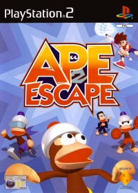
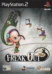
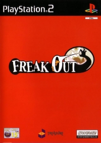
to a lesser degree stuff like this. with actual unique stickers on the front
Controller one on ape escape and the ring tone sticker on billy hatcher

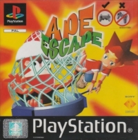
The hologram on ape escape doesn't have much value to the average pal collector it's just the same stuff for almost every ps1 game it's not worth the crappy images imo. but if we get a seperate option it's fine by me. I'm just saying that the value added by needing the hologram doesn't do much for the average guy your not educating anyone with it. it's pretty pointless. For unique stuff like the examples given I get it but the hologram is kinda pointless on all the other games